Microsoft Office
Landing Page Redesign
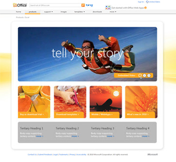
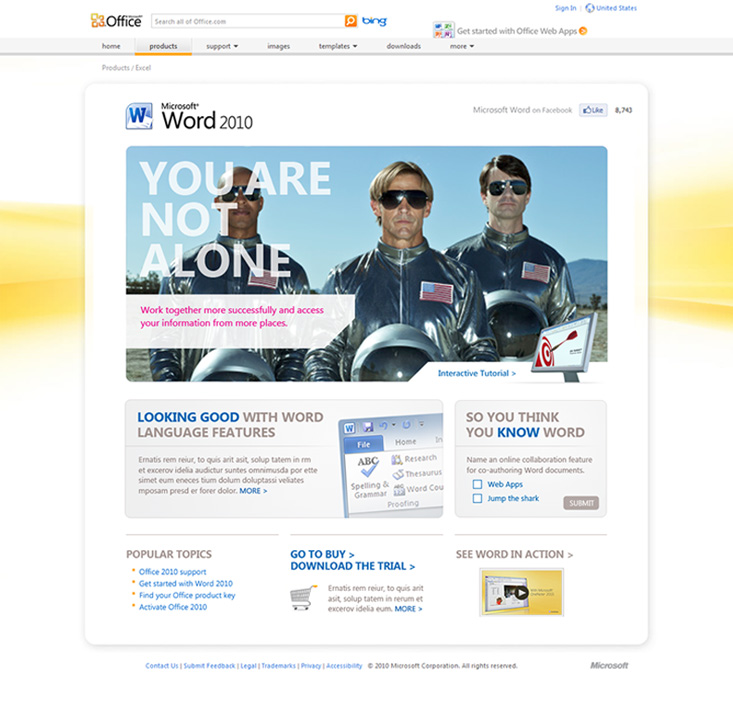
I was hired to implement a redesign of all Microsoft office landing pages. The initiative was created with the goal of engaging users more deeply by relying on the use of striking imagery and thought provoking messaging.
This redesign was accompanied by some new animation technology which allowed users to interact with the interface by mousing over key areas. This provided a user experience that is rich in conveying the many features of the Microsoft Office suite.
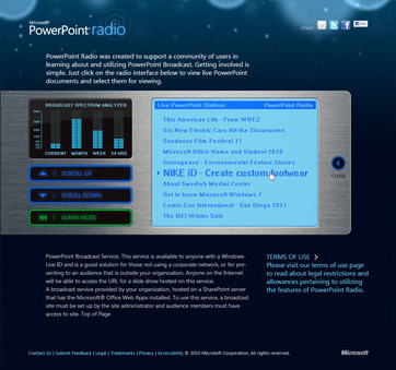
PowerPoint Radio
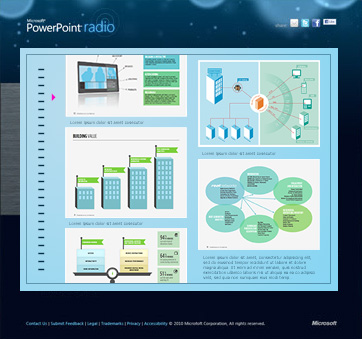
As part of the Office Suite web redesign I was tasked with the development of a new program to support a community of users in learning about PowerPoint and Powerpoint Broadcast. I created a user interface based on a digital radio platform where users had the ability post, view and interact with PowerPoint documents. This interactive element offered a sharing aspect for users never before seen on this platform.
Sophos Law Firm
Brand Identiy and Website
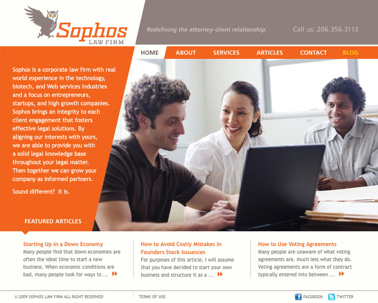
Sophos Law specializes in helping startups with all their legal matters regarding getting their business off the ground. They engaged me to develop a brand identity system to take their law firm to the next level of professionalism and to implement this system by utilizing a website as their primary marketing tool.
As with most branding projects I entered into a full informational gathering phase which included interviews and market research before diving into the design phase. After several rounds of revisions we landed on a logo, mood boards, color scheme, font set and messaging tone. I supplied them with a comprehensive brand style guide.
The stated goal was to stand out from the competition and to promote their commitment to making the legal process more comfortable for clients. We achieved this goal by utilizing warm interactive imagery and moving away from a more corporate feel to one that is more customer-centric.
Getty Images: Change Me Campaign
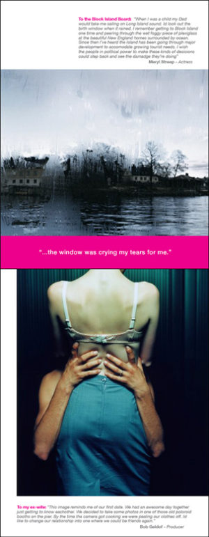
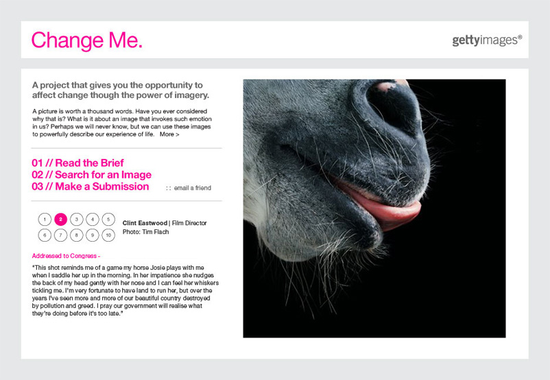
Getty Images is a visual media company with an archive of over 200 million assets. I was hired to develop a campaign with the goal of engaging both existing and new customers by motivating them to use Getty’s deep archive in order to illustrate how imagery can create change in the world. The team created the “Change Me” campaign which asked users to share personal accounts of the power that images had to change their lives and perspective. We enrolled celebrities to contribute submissions which were a key factor in garnering interest.
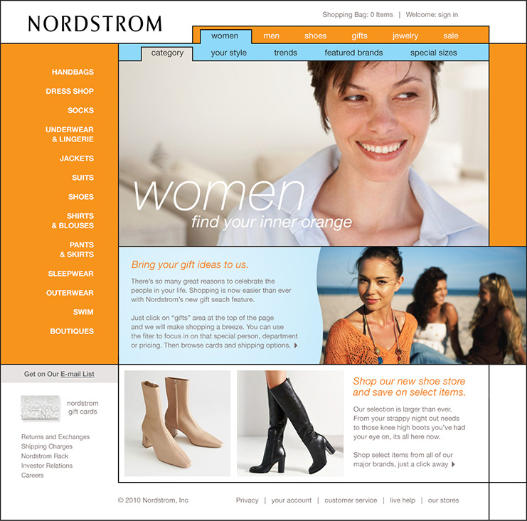
Nordstrom Website
Reinvent Color Redesign
During my time at Nordstrom.com as Lead Designer on the Creative Concept Team, I was tasked with a redesign of their customer facing website.
The existing neutral color palette had been chosen so as not to detract from the viewing experience of the product line, however customer analytics suggested the experience lacked “pop” and this feedback inspired the update.
Brighter colors were utilized on landing pages and areas that did not feature product heavy search results. I drew upon a Mondrian inspired grid to add bold visual cues and support a hierarchy of prioritized content.
Microsoft Diversity Website
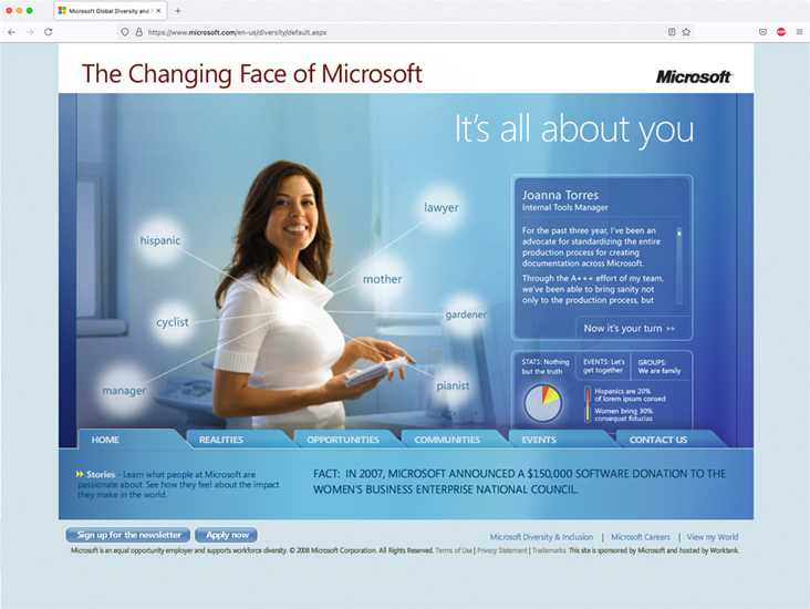
The Changing Face of Microsoft
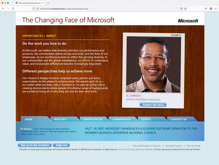
During my time at Worktank Seattle as lead Art Director for the Microsoft account I was an important part in pitching to the Diversity team and winning the chance to work on “The Changing Face of Microsoft” campaign.
This division is an important part of the Microsoft culture by focusing on a deeply inclusive workforce. They work hard to insure that people of color, women, people with disabilities and the LGBT community are represented within the company as well as engaging in various outreach programs around the world. A key focus of the campaign was to actively present opportunities to people of a diverse range of backgrounds by showing them the benefits of working at Microsoft.
The process involved a in depth research of the client needs and the potential needs of prospective employees. We worked through user experience scenarios and presented various methodologies for testing. I presented a creative direction focused on real people which utilized Polaroid snapshots of key employees throughout the company.
For the website, we produced video testimonials of these employees in which they shared personal stories about their experience regarding diversity and inclusion in the workplace.
Columbia Sportswear
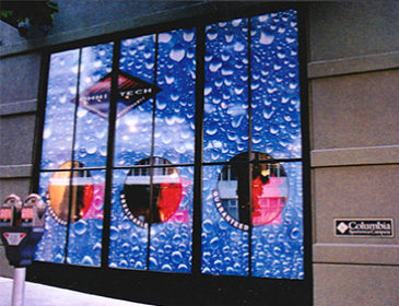
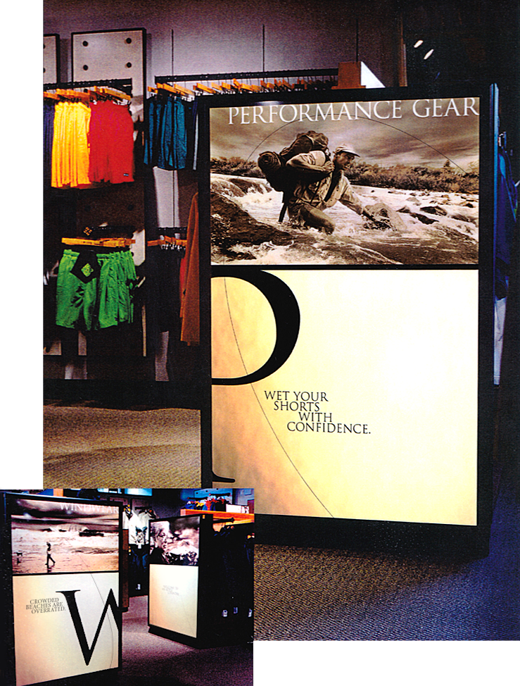
In Store Displays
I was hired onto the Columbia Sportswear creative team with the goal of updating their marketing materials with a fresh look to garner new customers and re-engage existing customers. This included introducing some processes and tools to streamline workflow in managing the creative team.
As part of my role I redesigned all of the point of sale signage at the flagship store in Portland Oregon. This included exploring and revising the customer experience regarding their journey throughout the store and their interaction with product and the sales team.
I adhered to some of the existing brand equity such as sepia tone imagery to leverage customer loyalty. This and the promotion of their CEO Gert Boyle hearkened back to their roots as a front runner in tough handmade outdoor gear.
Along with creating headlines that injected a sense of humor to their existing pool of photography I introduced some non-linear shapes and typography elements to create a more organic experience which was a clear break from the past. Customer feedback and sales proved the teams updates were successful.
Tangible Systems: Branding
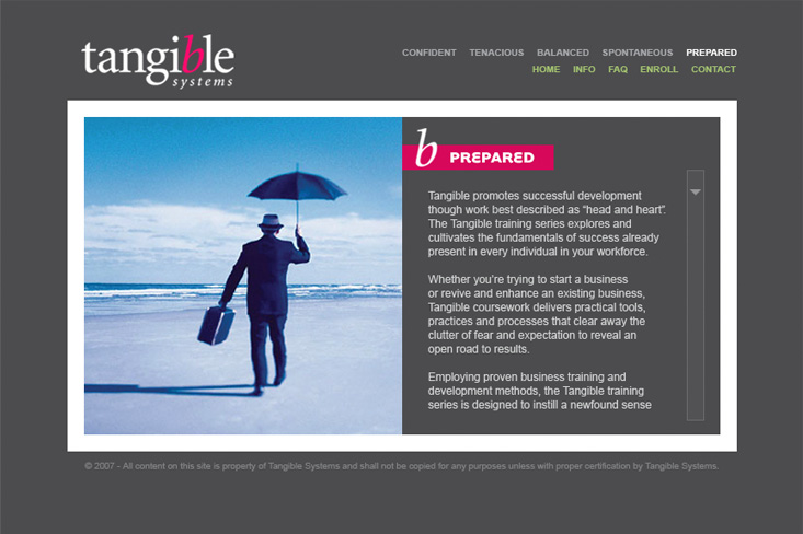
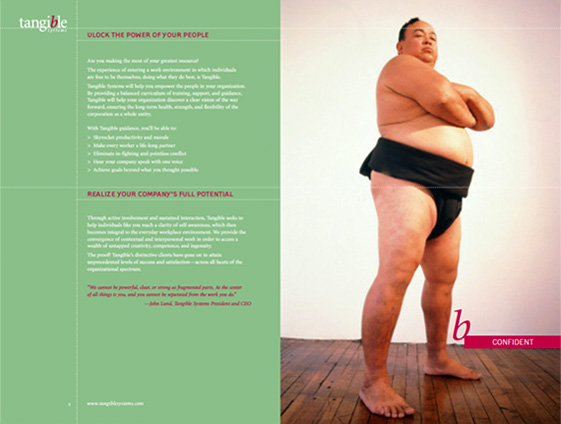
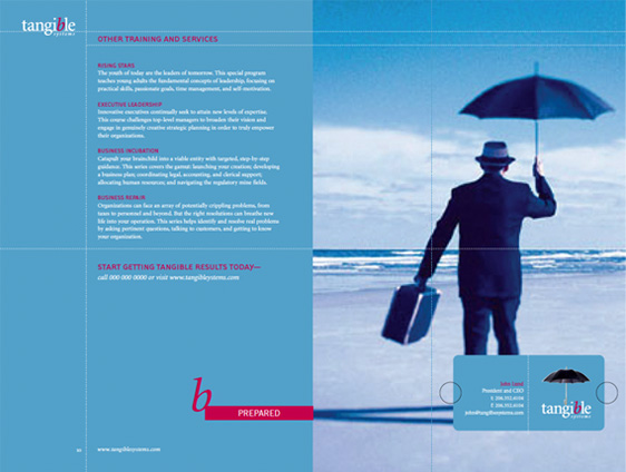
Tangible systems is a consulting firm which specializes in executive training in organizational and strategic management. To support their extensive experience within the industry they needed a brand identity which spoke directly to their stated mission.
I started with team interviews and we discussed the company’s goals and customer experience. My initial take away was that the team had a lot of passion around supporting people in being excited about their life and working at their potential. This lead to developing a campaign which was more emotional in conveying their passion.
I utilized thought provoking surreal imagery and single direct calls to action to catch peoples attention. This let them know that working with Tangible was a journey to a deeper place, one in which they would discover something powerful about themselves they may not have previously known.
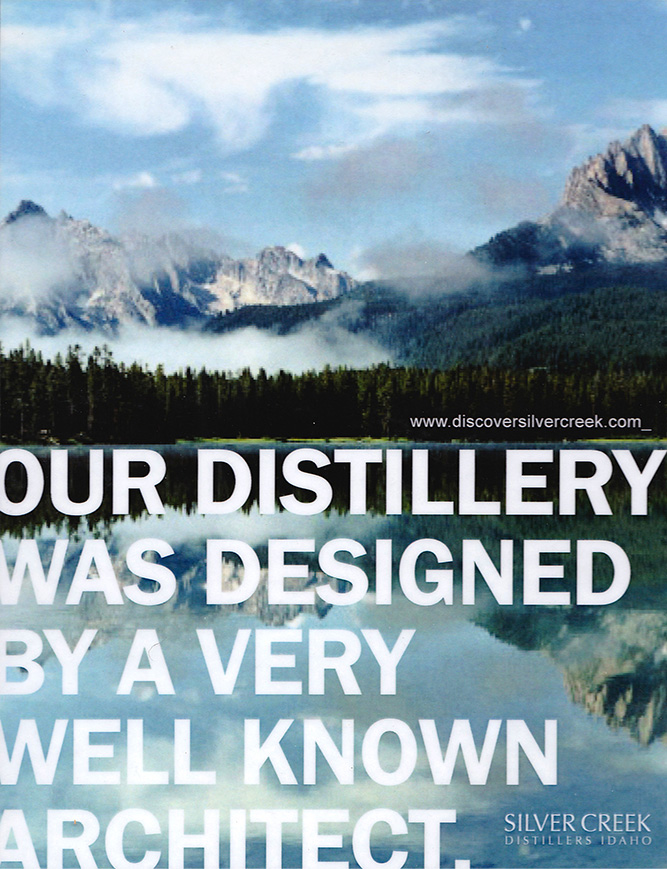
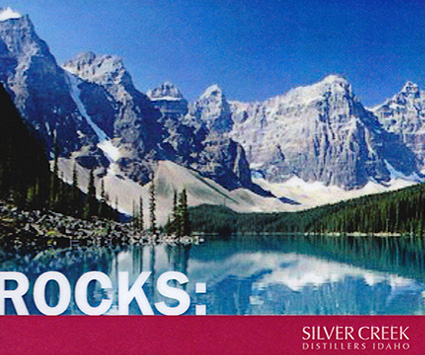
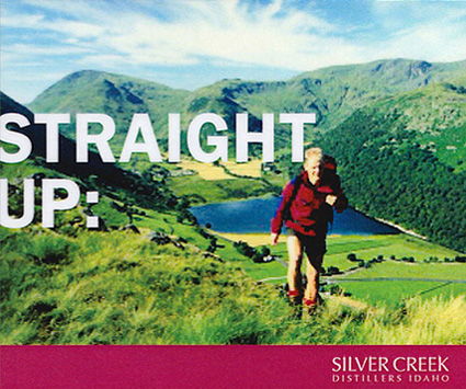
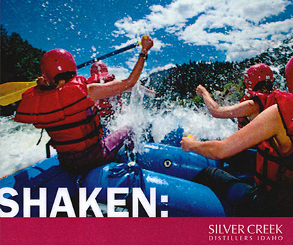
Silver Creek Distillers: Ad Campaign
Silver creek distillery produces the finest vodka in North America and their secret is simple: They use fresh Idaho potatoes and fresh Idaho mountain spring water. So when they came to Hadley Green to develop an Ad campaign that would describe their assets in the best light, our job was as simple as their product. As a B2B supplier we were able to stand out from the dry trade ads of competitors and tap into a more emotional response with bold headlines and nature photography. “With no additives or chemicals and Mother Nature as our partner, we are able to deliver your customers superior quality and taste.”

